Mental health care with Médecins Sans Frontières
Mental health in asylum seekers centers
In Belgium, the federal agency Fedasile welcomes 20,000 asylum seekers. In one of these 150 place centers, the agency was working in collaboration with Médecins sans Frontières (MSF), which contacted The Ink Link to create a tool addressing the subject of mental health.
MSF's mission at the center was to provide psycho-social support. But this mission was coming to an end in December 2018, and the team wanted to develop tools that could remain after their departure.
In the centers, the support staff noticed a great difficulty in helping the residents: their situation is precarious while awaiting the court decision (little activity, autonomy and cohabitation).
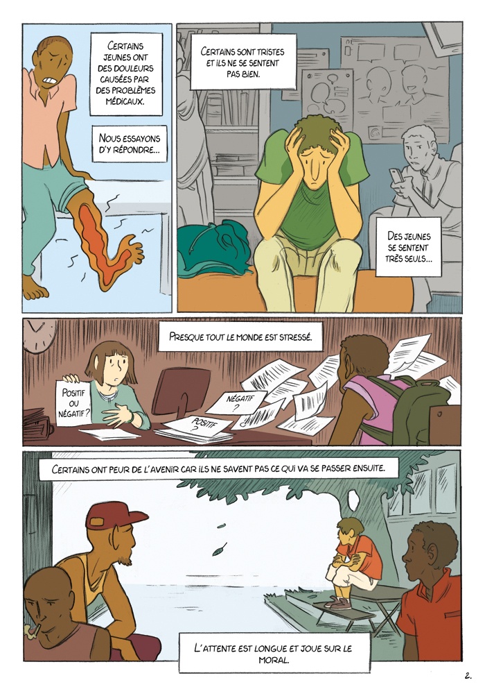
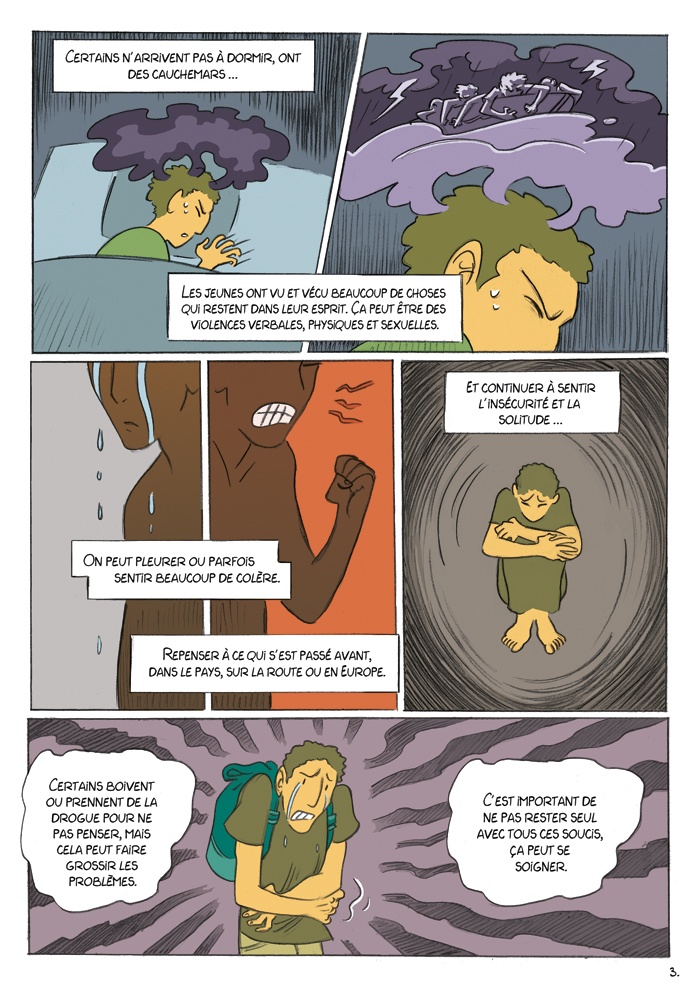
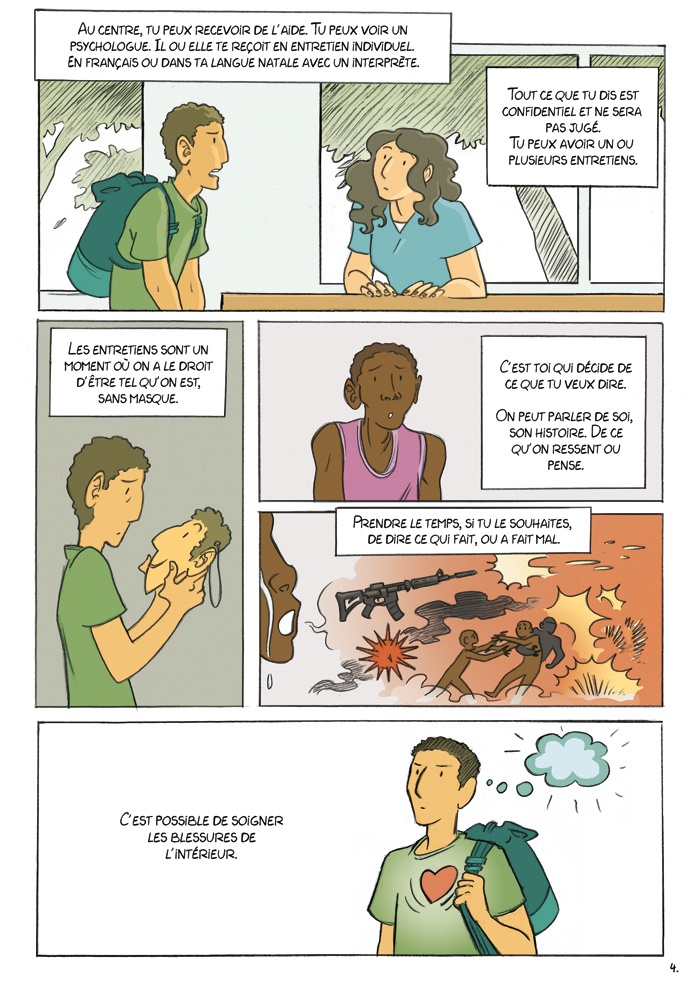
People in exile, especially the younger ones, often find it difficult to cope with psychological discomfort. Talking about it is complicated. It's a difficult notion to represent. To put this into images, the Ink Link teams worked in collaboration with MSF psychology experts and the people in exile themselves.
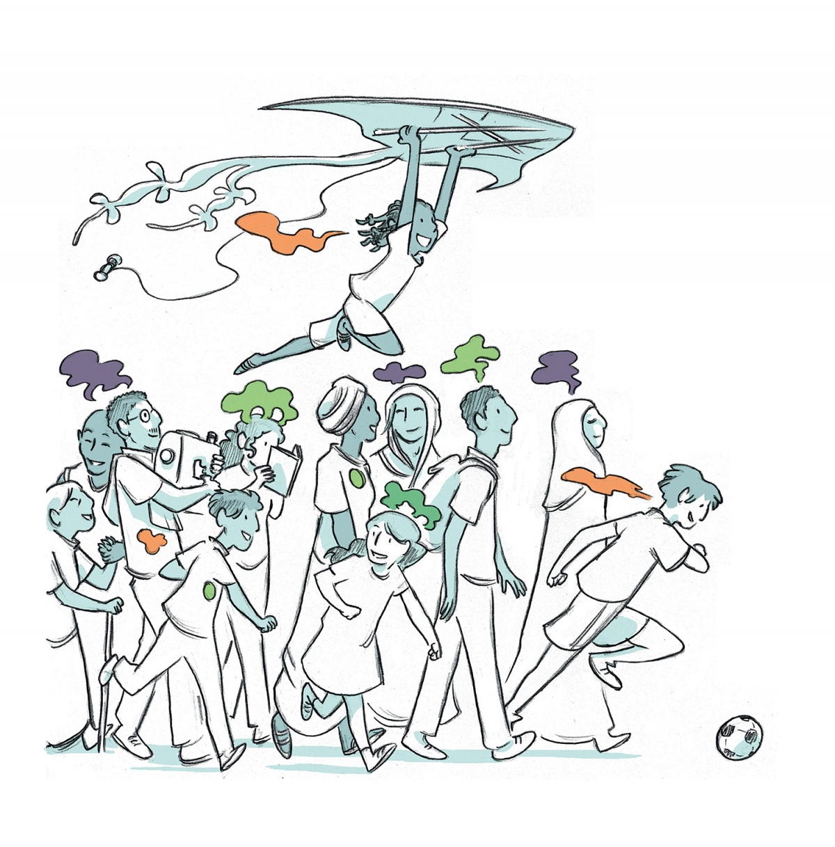
To accurately portray complex emotions, the first step was to be able to talk to the people in a climate of trust. To achieve this, The Ink Link team, with designer Louise Joor, first met people in exile at the center to draw their portraits. After collectif infirmation about the people's situation, backgrounds and daily life in the center, a scenario was created. It was approved at every stage by the MSF teams.
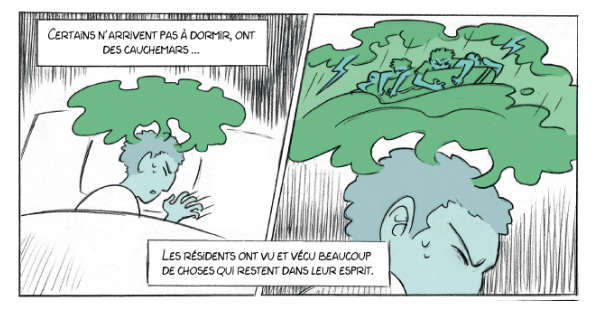
The storyboard
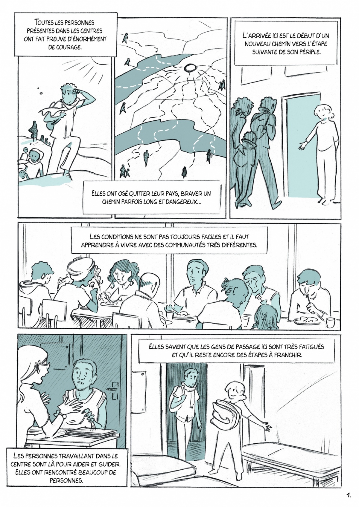
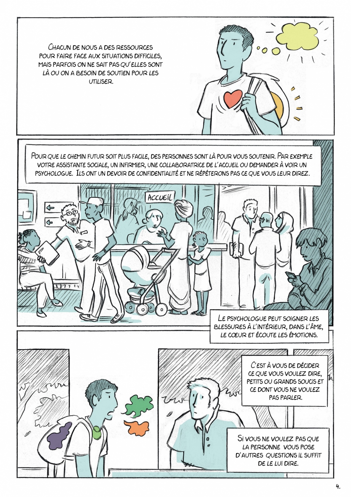
To ensure that the illustrations matched the people's concerns and representations, Louise visited the centers several times to learn more about the reality of asylum seakers. She reused the places she saw for the framework of the comic strip and, step by step, refined the representations to find the right tone.
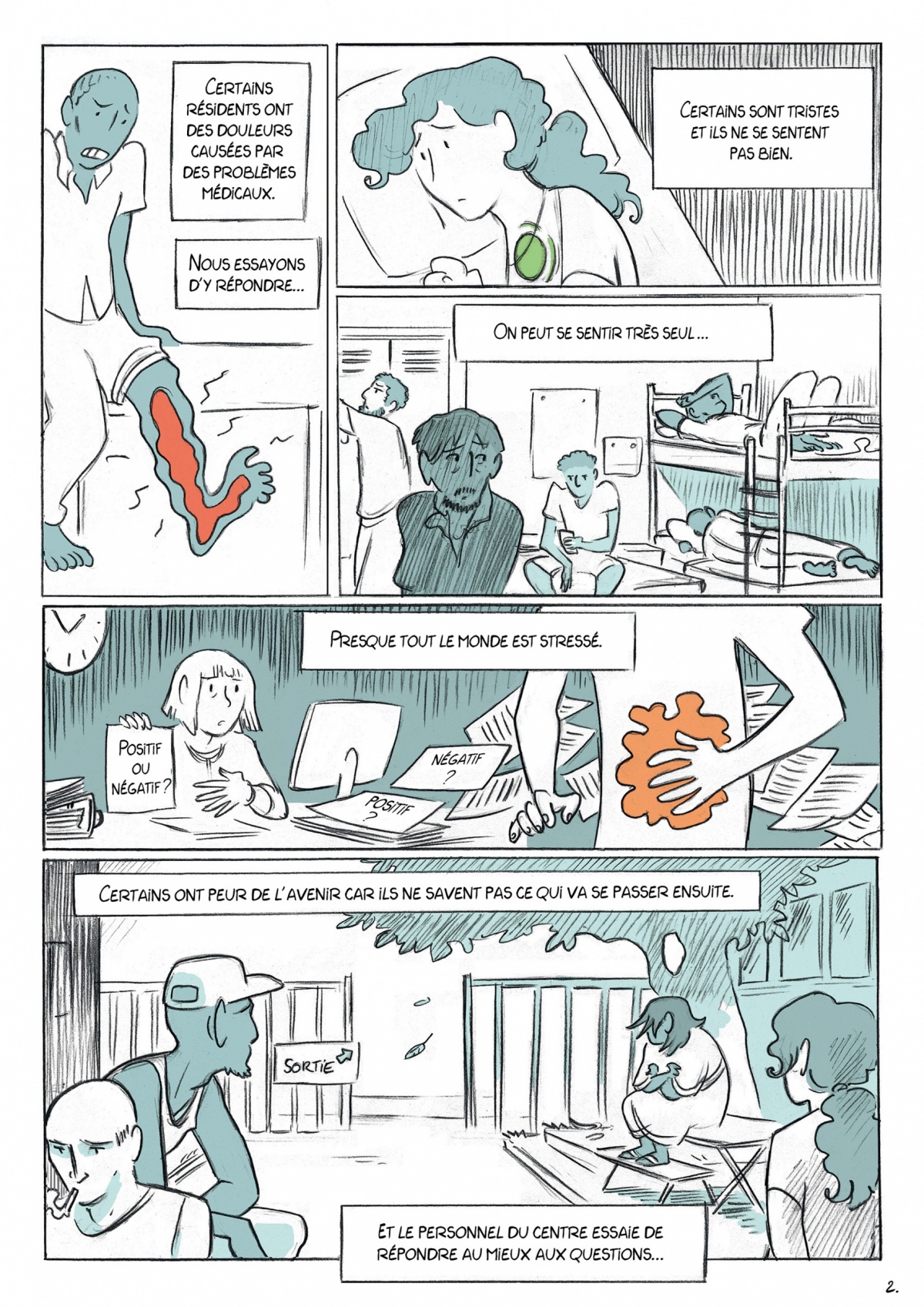
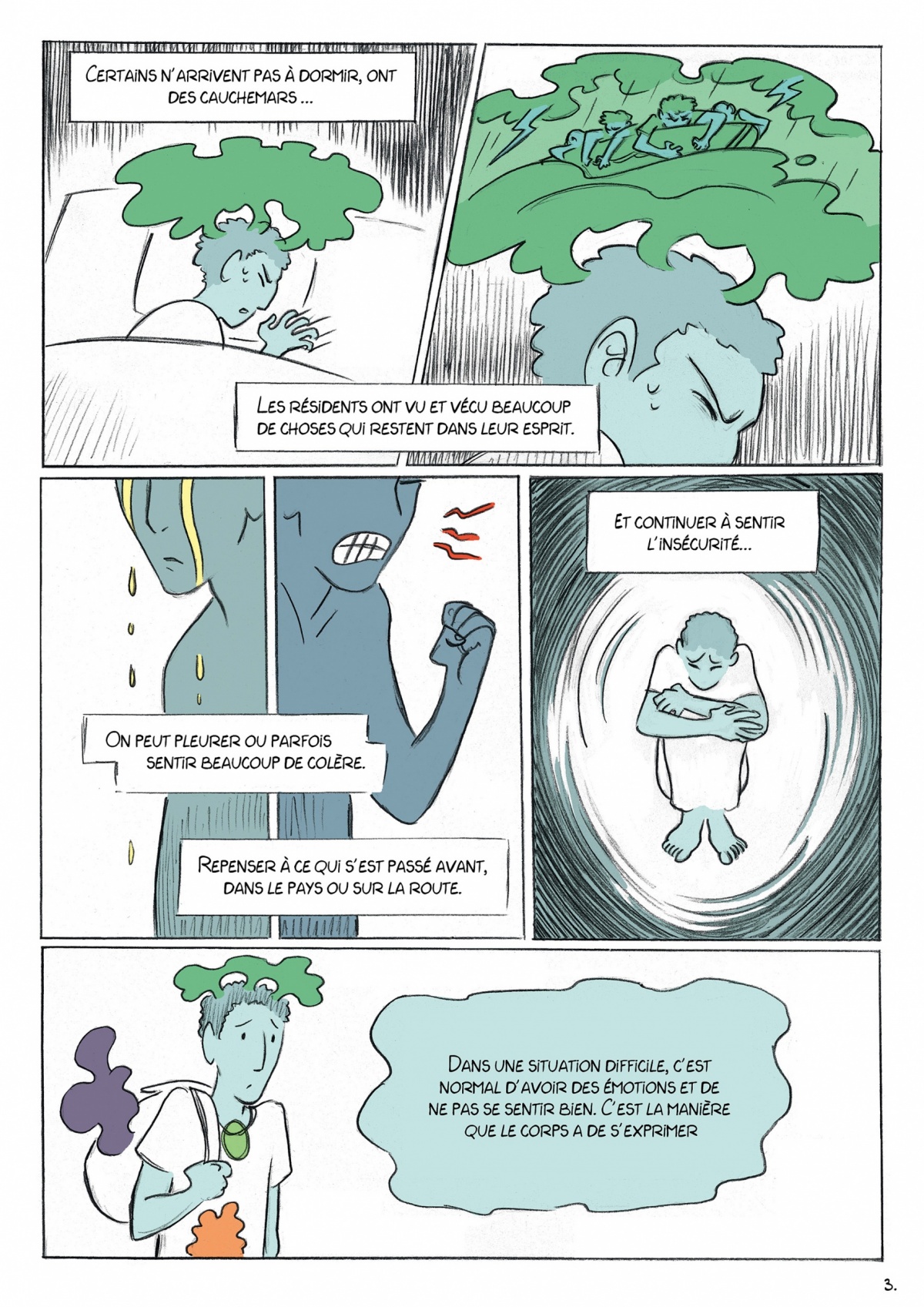
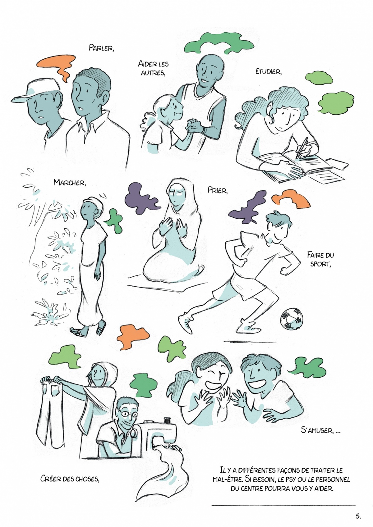
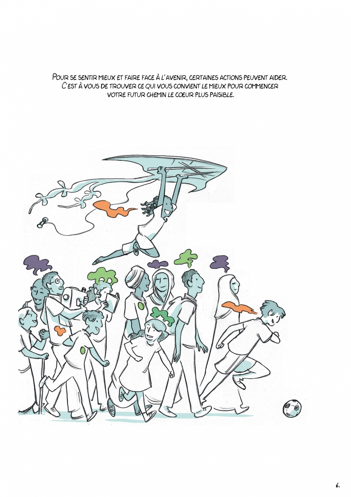
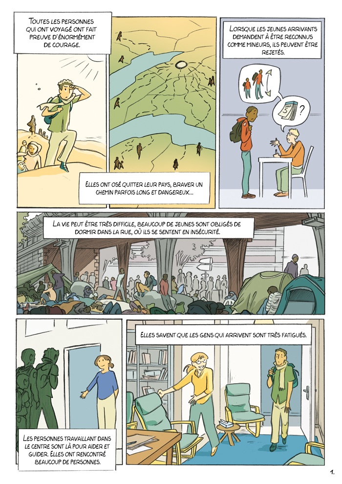
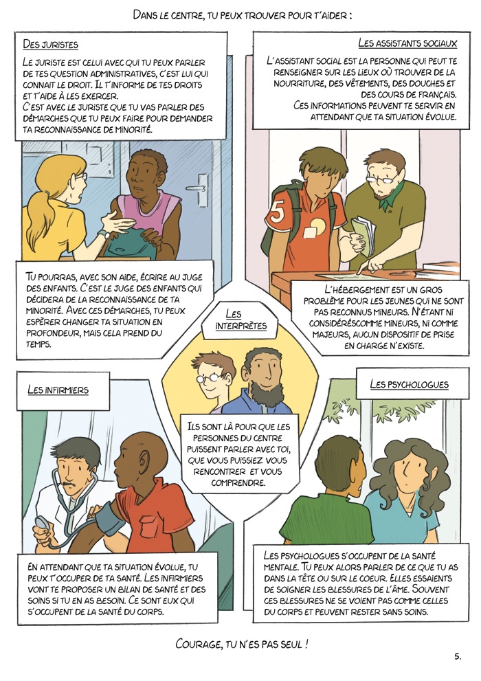
The text, in voice-over, speaks directly to the people in exile about their journeys, their concerns and tries to provide answers to their psychological suffering. It was also reworked and adjusted by the MSF teams as they went along, to convey the right emotions and avoid any misunderstandings,
The choice of black and white was made to highlight the emotions, which stand out from each other in color. This symbolism shows how important these feelings can be in relation to the world around us.
Several working versions
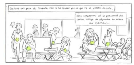
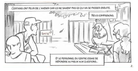
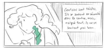
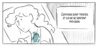
In this box, the first proposal gave the impression of boredom rather than anxiety, so Louise chose to change the point of view, with the characters looking towards the exit, to represent uncertainty about the future.
The form of the emotion clutching the young woman's throat was changed to avoid any misunderstanding.
In the end, four versions of the storyboard were needed to finalize this project, which is a good example of collaboration between artists, beneficiaries and solidarity players.
The final version was then translated into 6 languages to make it accessible to as many people as possible. It is available on request to all those wishing to use it-contact us!
Possible adaptations
Several months later, other reception centers in Paris called on our association to use the comic strip on their premises.
These establishments give shelter to unaccompanied minors, and wanted to highlight specific responses to angst. New meetings between our team and people in exile were therefore organized. Some situations didn't quite fit, so the comic strip was adapted.
This version exists with different characters representing people with lighter or darker skins, to enable everyone to better project themselves into it.
